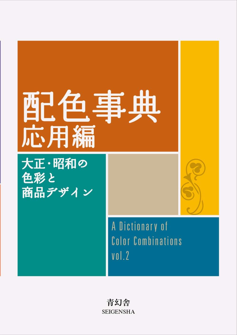

Dictionary Of Color Combinations - Volume 2: Gebundene Ausgabe
Desertcart purchases this item on your behalf and handles shipping, customs, and support to Japan.
Description
Specifications
| Best Sellers Rank | #828 in Design & Fashion (Books) |
| Dimensions | 10.7 x 1.7 x 14.8 cm |
| Importer | Bookswagon, 2/13 Ansari Road, Daryaganj, New Delhi 110002, [email protected], 01140159253 |
| Isbn 10 | 4861527724 |
| Isbn 13 | 978-4861527722 |
| Item Weight | 226 g |
| Language | Japanese |
| Packer | Bookswagon, 2/13 Ansari Road, Daryaganj, New Delhi 110002, [email protected], 01140159253 |
| Part Of Series | 青幻舎ビジュアル文庫シリーズ |
| Print Length | 336 pages |
| Publication Date | 3 January 2020 |
| Publisher | Seigensha Art Publishing |
Reviews
User
Cep kitap boyunda
Sorunsuz şekilde teslim edildi ilk kitabı istediğim halde o teslim edilemedi
User
Une référence incontournable pour tous ceux qui travaillent avec les couleurs
Les deux volumes forment un duo complémentaire indispensable. Chaque planche présente des combinaisons de couleurs avec leurs codes — une source d'inspiration directe pour le design, la déco ou l'impression. L'ouvrage japonais original est traduit avec soin, la qualité d'impression est au niveau. Un outil que l'on consulte régulièrement plutôt qu'on ne le lit d'un trait. Expédition rapide, livraison soignée. Un achat que je ne regrette absolument pas.
User
Great historical color theory reference.
Such a wonderful little book! Five stars for content and historical/design interest. 'The Man Behind the Viral Color Dictionary' by Bungu was what made me buy one of these. But these 'color dictionaries' go back hundreds of years.I bought it because my father had that 1930's color sense, and I wanted it to remember how he dressed, but it really is lovely and entertaining overall. I bought Vol 2 over Vol 1 because 1) Japanese colors are named after seasons and natural phenomena, so I thought this might have some additional intellectual clout (I like that sort of thing) and 2) I figured while this book has fewer combinations, the combinations have more colors 3-7 color combinations), so I could only use "part" of a combination and the combination still "works" (I just put my finger over the colors I don't like or or don't want to use and 'voila!'). So, here is the "bad stuff" - the cover is the same paper as the book pages, with a thinner paper slip cover, so the spine if pretty lightweight. Overtime, I'll probably lose pages, so you'll want to handle it pretty gingerly. Also, the colors are pretty off in the printing. If you look up the hex codes to the colors (which are available online) and then match it to the closest house paint they are not nearly so saturated. For example, I looked up one of the yellows and it was actually an off white.Anyhow, if you like color theory, or design it's worth a peek. I don't own enough clothes, or in a variety of enough colors for this to be useful in my closet - - but I might select my house colors with it.In the photo look at that Sulphur yellow in the center. The Royal Silk is the closest hex code paint I can find.There is some wiggle room with all these shades; and the book still "works" as a guide.
User
Interressant bij schilderen
Leuke kleure'combinaties
User
Inapiring
What a beautiful second edition account of colours and the way they may be presented in every day objects and materials. A truly remarkable set of combinations in a sort of manifest any sort of artist or designer in any single capacity could find useful, interesting, or at minimum, inspiring. Highly recommend this and the first edition.
Common Questions
Trustpilot