Customer Services
Copyright © 2025 Desertcart Holdings Limited


🕰️ Own the timeline, master the story of civilizations!
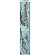
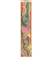
The ArtCantHurtU Histomap is a meticulously restored 17x77 inch poster charting 4,000 years of world history. Printed on premium matte paper with fade-resistant inks, it visually maps the rise and fall of civilizations through color-coded ethnic and cultural paths. Ideal for classrooms, homeschooling, or office decor, this vintage-inspired educational tool offers a dynamic, engaging way to explore global history from ancient times to modern eras.










| ASIN | B073NPQGMT |
| Best Sellers Rank | #111,864 in Office Products ( See Top 100 in Office Products ) #148 in Maps |
| Item model number | large histomap |
| Language | English, English, English, English |
| Manufacturer | Riley Creative Solutions |
| Product Dimensions | 195.58 x 43.18 x 0.51 cm; 170.1 g |
M**J
Very good quality
B**D
The last 100 years missing is a big deal actually. I'm still keeping it as it's extremely valuable for learning history. Lesson for all: Be honest in your marketing, then people like this reviewer won't post 1 star reviews.
D**H
I can't believe how much I love this histomap. As a minor historian I absolutely love seeing what has been happening when for the last 4000 years on Earth. I have this displayed on the front entryway to my home and people remark on it all the time. I even bought magnetic thumbtacks so that I don't put holes in it. Marvelous map.
K**E
The paper is good quality and matte. The “stains” are from the original copy, it’s a real antique map from the 1940s I believe. It’s really big and beautiful and I can always find new stuff to read about. I bought a magnetic poster holder, it’s two pairs of wooden strips that hold the top ends together because they are magnetic. The top one has a string and you can hang it with a hook in the wall. I bought this as a gift for a history buff and he loved it!
M**S
This is a really cool item. I would’ve given it five stars except that the “4000 years of world history,” which purports to run from 2000 BC to 2000 AD is highly misleading. In reality, the varying strengths of world civilizations stops in the 1930s, before World War II, so the map does not take into account the totality of the rise and fall of the USSR, the further of expansion of American power, the rise of China, the disintegration of the British Empire, and all of the geopolitical events of the last 70 years, etc. So although the map “goes up“ to 2000 A.D., it stops depicting the relative strength of civilizations as they were in the 1930s. It’s too bad the people that sel this map don’t have the ability and/or desire to update it in that regard. In my opinion, this maps paper is not cheap, and while it is not super high-quality printing, it’s good enough to look good and clear enough to read the entire thing without any problem.
Trustpilot
2 weeks ago
2 weeks ago